Blog
📚 Best Fonts for Every Designer: Typography That Works
Typography is the cornerstone of great design. The right font not only ensures readability but also defines the entire mood and personality of a website or brand. As designers, our goal is to choose typefaces that are clean, accessible, and versatile. Here are the top font families you should have in your toolkit, categorized for effective use.
💡 Sans-Serif Powerhouses (The Modern Classics)
Sans-serif fonts—those without the little feet—are the default choice for most modern web and UI design due to their exceptional clarity on screens.
- • Inter: Specifically designed for screens, Inter excels in user interfaces (UI). It's highly readable even at small sizes, making it perfect for body text, dashboards, and mobile views.
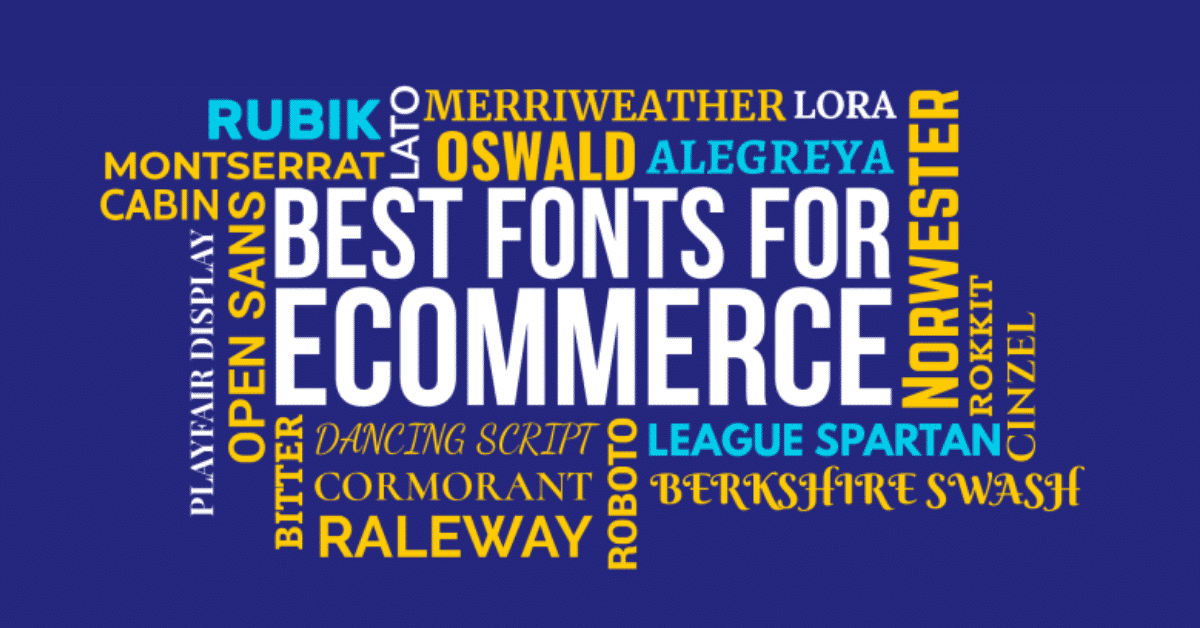
- • Roboto / Open Sans: The workhorses of Google Fonts. They are neutral, friendly, and come with a huge range of weights, offering maximum versatility for corporate, e-commerce, and content-heavy sites.
- • Poppins / Montserrat: These geometric sans-serifs offer a bold, structured look. Use them for powerful, modern headlines or branding that needs a strong visual presence.
👑 Serif Elegance (For Headlines and Editorial)
Serifs are making a strong comeback, adding sophistication, luxury, and a strong editorial feel.
- • Playfair Display: A high-contrast serif with a modern twist. It's excellent for large, elegant headlines on fashion blogs, portfolio titles, or luxury brand websites.
- • Merriweather / Lora: Both designed for on-screen reading, these are great choices for long-form body text where you want a classic, trustworthy, and pleasant reading experience.
⚖️ The Art of Font Pairing (Achieving Harmony)
A professional design often uses two, or at most three, different font families to establish a clear visual hierarchy.
Best Pairing Strategy: High-Contrast Harmony
Pairing a stylized display font with a hyper-readable body font creates visual interest while maintaining clarity:
Heading: Playfair Display (Bold)
Body Text: Roboto (Regular)
Best Pairing Strategy: Modern Monochromatic
Combining two different sans-serifs that still have distinct personalities is a clean, modern look:
Heading: Montserrat (Extra Bold)
Body Text: Inter (Regular)
✅ Final Tip: Prioritize Performance & Accessibility
Always use Google Fonts or similar web-optimized libraries for fast loading. Critically, ensure your font choice has strong contrast against its background (WCAG AA or AAA guidelines) and is legible across all weights and sizes, especially for small print. A beautiful font that's illegible is a broken design.