Blog
Mastering Layouts: The CSS Grid vs. Flexbox Showdown
Every great web application starts with a well-defined and responsive layout. In modern CSS, we primarily rely on two powerful tools: CSS Grid and Flexbox. While both are incredibly capable, knowing when to use each is key to mastering front-end development. Let's dive deep into the differences and the best use cases for both.
1. The One-Dimensional Powerhouse: Flexbox (Flexible Box Module)
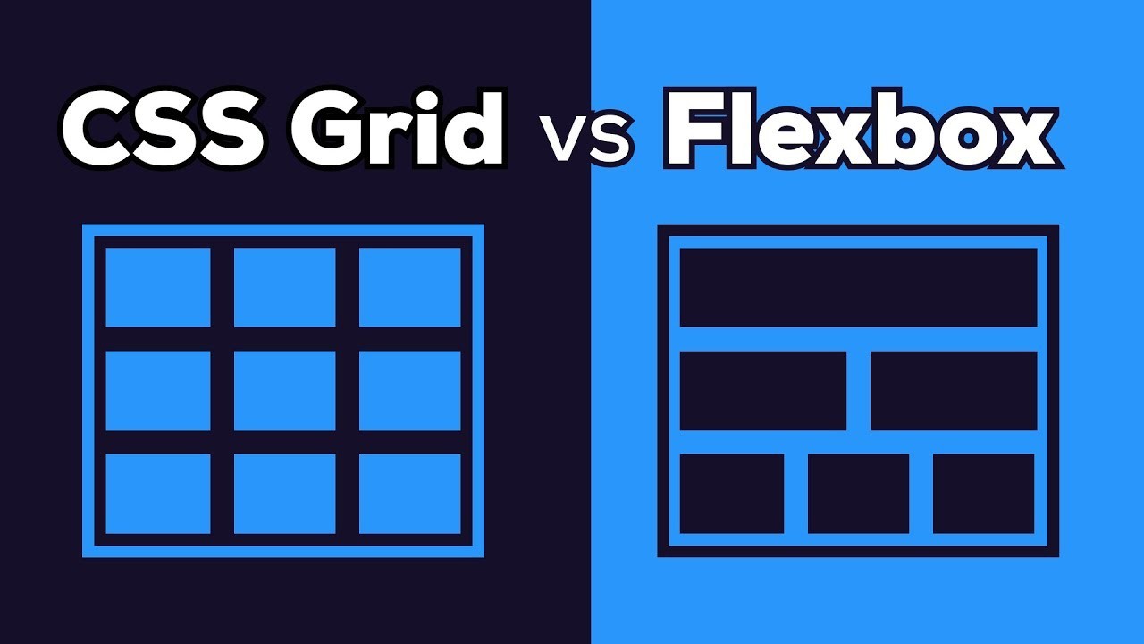
Flexbox is designed for one-dimensional layouts. This means it handles layout along a single line, either a row or a column, at a time. It's perfect for distributing space between items in an interface and aligning them dynamically, making it ideal for component-level alignment.
Best Use Cases for Flexbox:
- • Aligning navigation items in a header or footer.
- • Perfectly centering an element both vertically and horizontally.
- • Creating complex form layouts where fields need dynamic spacing.
- • Components where the content size determines the alignment (Content-out).
Here is a basic example of how to center an item using Flexbox:
    .container {
        display: flex;
        justify-content: center; /* Horizontally center */
        align-items: center; /* Vertically center */
        height: 100vh;
    }
2. The Two-Dimensional Maestro: CSS Grid Layout
CSS Grid is built for two-dimensional layouts. It allows you to define both rows and columns simultaneously, giving you the power to lay out major page areas rather than just small components. It is the standard for building a website's overall structure (header, sidebar, main content, footer).
Best Use Cases for CSS Grid:
- • Defining the main Page Layout (the site structure).
- • Creating complex galleries or card components where content items span multiple columns and rows.
- • Overlapping elements precisely in both dimensions.
- • Layouts where you define the container size and then place items (Layout-in).
Grid is defined by tracks (columns and rows) which makes placing items simple:
.site-wrapper {
    display: grid;
    grid-template-columns: 250px 1fr; /* Defines two columns: fixed sidebar and flexible main area */
    grid-template-rows: auto 1fr auto; /* Defines Header, Content, Footer rows */
}
Conclusion: They Work Better Together!
The best practice is often to use them in combination. Use CSS Grid to handle the macro (big picture) structure of your application—the main columns and rows of your page. Then, use Flexbox inside those Grid cells to handle the micro (small components) alignment and spacing of items. This combination gives you ultimate control and maintainability.
Start thinking of Grid for the page structure and Flexbox for the component content. Happy coding!